Best Data Visualization Tools for Non-Technical Teams
Introduction
In today’s data-driven world, the ability to understand and interpret complex information is no longer exclusive to data scientists and analysts. Non-technical teams, from marketing and sales to human resources and operations, increasingly rely on data to make informed decisions, identify trends, and measure performance. However, the sheer volume and complexity of data can be overwhelming, creating a significant barrier for those without specialized technical skills. This is where effective data visualization becomes indispensable.
Data visualization transforms raw, intricate datasets into easily digestible visual formats such as charts, graphs, and dashboards. For non-technical users, this means moving beyond spreadsheets and cryptic numbers to a clear, intuitive understanding of their business landscape. It empowers them to spot opportunities, identify challenges, and communicate insights effectively without needing to write a single line of code or delve into complex statistical models.
This article aims to demystify the world of data visualization for non-technical teams. We will explore the best data visualization tools specifically designed with ease of use in mind, highlighting their core features, the benefits they offer to everyday business users, and their pricing structures. Our goal is to equip you with the knowledge to choose the right tool that can transform your team’s data into actionable intelligence, fostering a truly data-driven culture within your organization.
Understanding Data Visualization for Non-Technical Users
Data visualization is the graphical representation of information and data. By using visual elements like charts, graphs, and maps, data visualization tools provide an accessible way to see and understand trends, outliers, and patterns in data. For non-technical users, its importance cannot be overstated. It bridges the gap between raw data and actionable insights, enabling quicker comprehension and more effective decision-making across all departments.
Why is Data Visualization Crucial for Non-Technical Teams?
- Enhanced Comprehension: Visuals are processed much faster by the human brain than text or numbers, leading to quicker understanding of complex data.
- Improved Decision-Making: Clear visualizations help identify key trends and patterns, allowing teams to make data-backed decisions with confidence.
- Effective Communication: Visual stories are easier to share and explain to stakeholders, fostering alignment and collaboration.
- Spotting Trends and Outliers: Visual representations make it simple to detect anomalies or emerging trends that might be hidden in tabular data.
- Increased Engagement: Interactive dashboards encourage exploration and engagement with data, turning passive consumers into active participants.
Key Characteristics of User-Friendly Data Visualization Tools:
- Intuitive Interface: A clean, uncluttered design that is easy to navigate, even for first-time users.
- Drag-and-Drop Functionality: Simplifies the process of building charts and dashboards by allowing users to easily move data fields and visualization types.
- Pre-built Templates and Dashboards: Offers ready-to-use designs that can be customized, saving time and effort.
- Easy Data Integration: Seamlessly connects to various data sources (e.g., Excel, Google Sheets, cloud databases) without requiring complex setup.
- Collaboration Features: Allows multiple team members to work on, share, and comment on visualizations in real-time.
- Minimal to No Coding Required: Designed for users who prefer visual interfaces over scripting or programming.
- Interactive Elements: Features like filters, drill-downs, and tooltips that allow users to explore data dynamically.
Top Data Visualization Tools for Non-Technical Teams
1. Tableau Public
Tableau Public is a free platform that allows users to explore, create, and publicly share interactive data visualizations online. It’s an excellent starting point for individuals and small teams looking to gain experience with data visualization without a significant financial investment. While it’s the free version of the more robust Tableau Desktop, it still offers powerful capabilities for creating compelling visual stories.
- Key Features: Connects to various data formats, drag-and-drop interface, interactive visualizations, large repository of public visualizations for learning and inspiration.
- Benefits for Non-Technical Users: No coding required, intuitive interface, access to a vast community and learning resources, ideal for building an online portfolio.
- Price Indication: Free.
2. Microsoft Power BI
Microsoft Power BI is a business intelligence tool that helps users connect to various data sources, transform data, and create interactive reports and dashboards. It’s part of the Microsoft Power Platform, offering seamless integration with other Microsoft products like Excel and Teams. Power BI is known for its robust capabilities and ability to handle large datasets, making it suitable for both small businesses and large enterprises.
- Key Features: Connects to over 100 data sources, drag-and-drop report creation, AI capabilities for insights, integration with Microsoft 365, mobile apps.
- Benefits for Non-Technical Users: User-friendly interface, extensive training resources, ability to create visually appealing reports without coding, strong integration with familiar Microsoft tools.
- Price Indication: Free account available; Power BI Pro: $14.00 per user/month (paid yearly); Power BI Premium Per User: $24.00 per user/month (paid yearly).
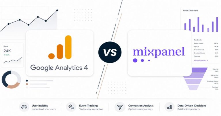
3. Google Looker Studio (formerly Google Data Studio)
Google Looker Studio is a free, web-based tool that allows users to create customizable, interactive reports and dashboards. It’s particularly strong for those already using Google’s ecosystem, such as Google Analytics, Google Ads, and Google Sheets. Looker Studio excels at turning raw data from various sources into easily understandable visual formats, making it a favorite for marketing and analytics teams.
- Key Features: Free to use, connects to 800+ data sources (including Google products), drag-and-drop report builder, real-time collaboration, embeddable reports.
- Benefits for Non-Technical Users: Extremely easy to use, no coding required, excellent for visualizing marketing and web analytics data, strong community support.
- Price Indication: Free. Looker Studio Pro offers additional enterprise features with custom pricing (starts around $35K/year for Looker, not Looker Studio).
4. Infogram
Infogram is an intuitive online tool for creating interactive charts, maps, infographics, and reports. It’s designed to help users tell visual stories with data, offering a wide range of templates and design options. Infogram is particularly popular for its ability to produce visually engaging content quickly, making it a great choice for presentations and content marketing.
- Key Features: 35+ interactive chart types, 800+ map types, drag-and-drop editor, pre-built templates, AI image maker, advanced editing features, data connections.
- Benefits for Non-Technical Users: User-friendly interface, focus on visual storytelling, quick creation of professional-looking graphics, no design skills needed.
- Price Indication: Basic: Free; Pro: $19/month (billed annually); Business: $49/month (billed annually); Enterprise: Custom pricing.
5. Canva
While primarily known as a graphic design platform, Canva has significantly expanded its data visualization capabilities, making it a strong contender for non-technical users. It allows users to create a wide array of charts, graphs, and infographics using its intuitive drag-and-drop interface and extensive template library. Canva is ideal for teams that need to integrate data visuals into broader design projects, such as presentations, social media graphics, or marketing materials.
- Key Features: Easy drag-and-drop editor, millions of templates, photos, and graphics, AI-powered design tools, collaboration features, integration with Flourish for interactive data visualization.
- Benefits for Non-Technical Users: Extremely accessible for design novices, vast library of visual assets, seamless integration of data into creative projects, affordable pricing.
- Price Indication: Free; Pro: US$144/year for one person; Business: US$250/year per person; Enterprise: Custom pricing.
6. Qlik Sense
Qlik Sense is a powerful self-service data analytics and visualization platform that empowers users to explore data freely and uncover insights. While it offers advanced capabilities, Qlik Sense is designed with an associative engine that allows non-technical users to easily navigate and interact with data without predefined queries. It’s known for its flexibility and ability to handle complex data relationships.
- Key Features: Associative data engine, drag-and-drop interface, interactive dashboards, AI-powered insights, robust data integration, self-service analytics.
- Benefits for Non-Technical Users: Intuitive data exploration, no need for SQL or complex queries, ability to create dynamic and interactive visualizations, strong governance and scalability for growing teams.
- Price Indication: Qlik Cloud Standard: $300/month (includes 10 full user licenses); User-based licenses (Professional: $70-$150/month, Analyzer: $30-$50/month, Viewer: $15-$25/month).
How to Choose the Right Tool for Your Team
Selecting the ideal data visualization tool depends on your team’s unique requirements and goals. Consider the following factors:
- Team’s Specific Needs and Skill Level: Assess whether your team requires basic charting or advanced analytical capabilities. Tools like Tableau Public, Looker Studio, Infogram, and Canva are excellent for beginners, while Power BI and Qlik Sense offer more depth for growing needs.
- Data Sources and Integration Requirements: Evaluate the types of data you work with and ensure the tool can seamlessly connect to your existing databases, spreadsheets, or cloud services.
- Budget: Determine your financial constraints. Many tools offer free tiers or trials, but advanced features and scalability often come with a subscription.
- Scalability: Consider your future growth. Will the tool be able to handle increasing data volumes and user numbers as your team expands?
- Support and Community: Look for tools with strong documentation, active user communities, and responsive customer support to assist your team when challenges arise.
Conclusion
Data visualization is no longer a niche skill but a fundamental requirement for any team aiming to thrive in a data-rich environment. The tools discussed above — Tableau Public, Microsoft Power BI, Google Looker Studio, Infogram, Canva, and Qlik Sense — each offer unique strengths tailored to different needs and skill levels. From free, easy-to-use platforms perfect for beginners to more comprehensive solutions for advanced analytics, there’s a tool out there to empower every non-technical team.
By leveraging the power of visual data, your team can transform raw numbers into compelling narratives, make more informed decisions, and ultimately drive greater success. We encourage you to explore these options, take advantage of free trials, and find the data visualization tool that best fits your organization’s journey towards data literacy and insight-driven action.