How to Build a SaaS Metrics Dashboard with Analytics Tools
Introduction: The Indispensable Role of SaaS Metrics Dashboards
In the dynamic world of Software as a Service (SaaS), understanding performance is not merely beneficial; it is absolutely critical for sustained growth and success. A well-constructed SaaS metrics dashboard serves as the central nervous system of your business, providing real-time insights into the health, efficiency, and future trajectory of your operations. Without a clear, consolidated view of key performance indicators (KPIs), SaaS companies risk making uninformed decisions, missing crucial growth opportunities, and failing to address underlying issues before they escalate. This guide will walk you through the essential steps to build an effective SaaS metrics dashboard using various analytics tools, ensuring you have the data-driven foundation needed to thrive.
Why a SaaS Metrics Dashboard is Non-Negotiable
A robust dashboard offers several profound advantages. Firstly, it provides clarity and focus by highlighting the most important metrics that drive business outcomes. Secondly, it fosters accountability across teams, as everyone can see the impact of their efforts on shared goals. Thirdly, it enables proactive decision-making, allowing leaders to identify trends, anticipate challenges, and pivot strategies swiftly. Finally, it supports investor relations by presenting a transparent and compelling narrative of the company’s performance.
Understanding Key SaaS Metrics
Before diving into dashboard construction, it’s imperative to understand the core SaaS metrics that will populate it. These metrics fall into several categories, each offering a unique perspective on your business.
Revenue Metrics
Revenue is the lifeblood of any business, and SaaS is no exception. Key revenue metrics include:
- Monthly Recurring Revenue (MRR) / Annual Recurring Revenue (ARR): The predictable revenue a company expects to receive every month or year. This is arguably the most critical metric for SaaS businesses, indicating stability and growth potential.
- Average Revenue Per User (ARPU) / Average Revenue Per Account (ARPA): The average revenue generated from each user or account over a specific period. This helps in understanding customer value and pricing strategies.
- Expansion MRR: Additional revenue generated from existing customers through upsells, cross-sells, or increased usage. A high Expansion MRR signifies strong product adoption and customer satisfaction.
- Churn MRR: Revenue lost from existing customers due to cancellations or downgrades. Minimizing churn MRR is vital for sustainable growth.
Customer Metrics
Customer-centric metrics provide insights into customer acquisition, retention, and satisfaction.
- Customer Acquisition Cost (CAC): The total cost associated with acquiring a new customer. A low CAC is indicative of efficient marketing and sales efforts.
- Customer Lifetime Value (CLTV / LTV): The predicted revenue that a customer will generate throughout their relationship with your company. A healthy CLTV:CAC ratio (ideally 3:1 or higher) is crucial for long-term profitability.
- Customer Churn Rate: The percentage of customers who cancel their subscriptions over a given period. High churn rates can severely impede growth.
- Net Promoter Score (NPS): A widely used market research metric that measures customer loyalty and satisfaction. It helps gauge customer sentiment and identify areas for improvement.
Engagement and Usage Metrics
These metrics reveal how users interact with your product, indicating its value and stickiness.
- Daily Active Users (DAU) / Monthly Active Users (MAU): The number of unique users engaging with your product daily or monthly. These metrics are fundamental for understanding product adoption and engagement levels.
- Feature Adoption Rate: The percentage of users who utilize specific features within your product. This helps validate feature development and identify underutilized functionalities.
- Session Duration / Frequency: How long and how often users interact with your application. Higher duration and frequency often correlate with greater perceived value.
Choosing the Right Analytics Tools
The market is replete with powerful analytics tools, each with its strengths. The best choice for your SaaS business will depend on your specific needs, budget, and technical capabilities.
Categories of Analytics Tools
- Business Intelligence (BI) Platforms: Tools like Tableau, Power BI, and Looker (Google Cloud) offer comprehensive data visualization, reporting, and dashboarding capabilities. They are ideal for aggregating data from multiple sources and creating sophisticated, interactive dashboards.
- Product Analytics Tools: Platforms such as Mixpanel, Amplitude, and Pendo focus on user behavior, feature adoption, and conversion funnels. They provide deep insights into how users interact with your product.
- Marketing Analytics Tools: Google Analytics, HubSpot, and Salesforce Marketing Cloud help track website traffic, campaign performance, and lead generation. These are essential for understanding the effectiveness of your marketing efforts.
- Data Warehouses & ETL Tools: Solutions like Snowflake, BigQuery, and Fivetran are crucial for consolidating data from disparate sources into a central repository, making it easier to analyze. ETL (Extract, Transform, Load) tools automate the data integration process.
Key Considerations When Selecting Tools
When evaluating analytics tools, consider the following:
- Integration Capabilities: How well does the tool integrate with your existing tech stack (CRM, billing systems, marketing platforms)? Seamless integration is paramount for a unified data view.
- Scalability: Can the tool handle your growing data volumes and user base? Choose a solution that can scale with your business.
- Ease of Use: Is the interface intuitive for your team? A user-friendly tool encourages broader adoption and self-service analytics.
- Customization and Flexibility: Can you tailor dashboards and reports to your specific business questions? The ability to customize is key to extracting meaningful insights.
- Cost: Evaluate the pricing model and ensure it aligns with your budget. Some tools offer tiered pricing based on data volume or user count.
Step-by-Step Guide to Building Your SaaS Metrics Dashboard
Building an effective dashboard is an iterative process that involves careful planning, execution, and refinement.
Step 1: Define Your Goals and Audience
Before you even open an analytics tool, clearly articulate what you want to achieve with your dashboard. Are you tracking overall business health, optimizing marketing campaigns, or monitoring product engagement? Identify the primary users of the dashboard (e.g., executives, marketing team, product managers) and their specific information needs. This will dictate which metrics to include and how to visualize them.
Step 2: Identify Key Metrics (KPIs)
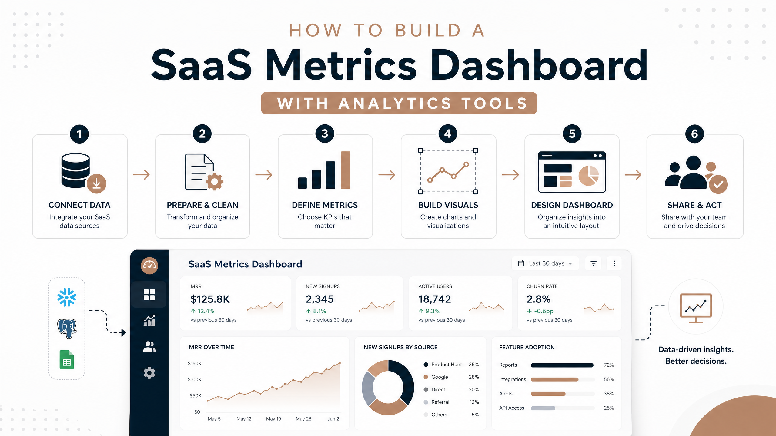
Based on your goals and audience, select the most relevant SaaS metrics. Avoid the temptation to include every possible metric; focus on those that are actionable and directly contribute to your objectives. For an executive dashboard, MRR, churn, CAC, and LTV might be paramount. For a product team, DAU, feature adoption, and session duration would be more critical.
Step 3: Consolidate Your Data Sources
SaaS data often resides in various systems: your billing platform (Stripe, Chargebee), CRM (Salesforce, HubSpot), marketing automation (Marketo), and product databases. You’ll need to bring this data together. This typically involves:
- Direct Integrations: Many analytics tools offer native connectors to popular SaaS platforms.
- ETL Tools: For more complex data pipelines, use ETL tools like Fivetran, Stitch, or Airbyte to extract, transform, and load data into a data warehouse (e.g., Snowflake, BigQuery).
- APIs: If direct integrations or ETL tools aren’t available, you might need to leverage APIs to pull data programmatically.
Step 4: Choose Your Dashboarding Tool
Select the BI or product analytics tool that best fits your consolidated data and visualization needs. Popular choices include:
- Tableau: Excellent for highly interactive and visually rich dashboards, best for complex data exploration.
- Power BI: Strong integration with Microsoft ecosystem, good for businesses already using Microsoft products.
- Looker (Google Cloud): Data modeling layer (LookML) provides consistency and flexibility, ideal for data-savvy teams.
- Mixpanel / Amplitude: Best for deep product usage analytics and understanding user journeys.
- Google Data Studio (Looker Studio): Free, easy-to-use for basic dashboards, good for marketing and sales teams.
Step 5: Design and Build Your Dashboard
This is where you bring your data to life. Follow these design principles:
- Simplicity: Avoid clutter. Each dashboard should tell a clear story. Use white space effectively.
- Visual Hierarchy: Place the most important metrics prominently. Use larger fonts or distinct colors for key figures.
- Appropriate Visualizations: Choose chart types that best represent your data. Line charts for trends (MRR over time), bar charts for comparisons (CAC by channel), pie charts for proportions (churn reasons).
- Interactivity: Allow users to filter, drill down, and explore data. This empowers them to answer their own questions.
- Context: Provide context for each metric. Include targets, benchmarks, or comparisons to previous periods to make the numbers meaningful.
Step 6: Validate and Iterate
Once your dashboard is built, don’t consider it final. Validate the data accuracy, gather feedback from your audience, and iterate. Are the metrics correct? Is the dashboard easy to understand? Does it answer the key business questions? Continuous improvement is essential.
Best Practices for SaaS Metrics Dashboards
To maximize the utility of your dashboard, adhere to these best practices:
- Keep it Focused: Each dashboard should have a specific purpose and audience. Avoid creating a single, monolithic dashboard that tries to do everything.
- Ensure Data Accuracy: Garbage in, garbage out. Regularly audit your data sources and ETL processes to ensure the data feeding your dashboard is reliable.
- Provide Context and Definitions: Clearly define each metric and provide context (e.g.,
how it’s calculated, what’s a good benchmark). This prevents misinterpretation. - Automate Data Refresh: Ensure your dashboard data is refreshed automatically and frequently enough to provide timely insights. Real-time or near real-time data is often crucial for SaaS.
- Make it Actionable: The ultimate goal of a dashboard is to drive action. If a metric is consistently red, what steps can be taken? The dashboard should facilitate this thought process.
- Regularly Review and Update: Business priorities evolve, and so should your dashboard. Periodically review its relevance and update metrics or visualizations as needed.
Conclusion: Empowering Growth Through Data-Driven Decisions
Building a SaaS metrics dashboard is an ongoing journey, not a one-time project. It requires a clear understanding of your business objectives, a thoughtful selection of metrics, the right analytics tools, and a commitment to continuous refinement. By following the steps outlined in this guide, you can create a powerful, insightful dashboard that not only tracks your performance but actively empowers your team to make data-driven decisions, optimize strategies, and ultimately, accelerate your SaaS company’s growth. Embrace the power of data, and watch your business flourish.
Ready to Transform Your SaaS Business?
Start building your comprehensive SaaS metrics dashboard today and unlock the full potential of your data. Explore leading analytics tools and resources to take your business to the next level.